
Coming from a 3D animation background, I’ve spent most of my time focusing on 3D creation and I had little hands-on experience with 2D workflows. The opportunity to join an animation project became a valuable chance to learn and grow.
I used to think great visual work only relies on precise motion and polished rendering. Afterworking practically on 2D tasks, I’ve come to appreciate the unique charm and artistic value of 2D animation made with Photoshop and After Effects.
On this project, I mainly handled 2D animation using Adobe Photoshop and After Effects. I also took part in full-process color grading with DaVinci Resolve. Here’s my real experience and takeaways from this workflow.
2D Animation: Refining Visuals Through Attention to Detail
I started with original Photoshop artwork provided by my supervisor, completing layer separation and asset organization. Then in After Effects, I worked on character rigging, motion animation, dynamic compositing, and frame clean-up.
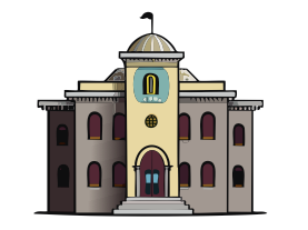
Background image used for 2D animation in Frames of Reference
As a 3D artist new to 2D, I initially applied 3D thinking to 2D animation, resulting in rigid, unnatural movement that lacked the fluid charm of traditional 2D. Thankful for my supervisor’s patient feedback and revision guidance, I gradually understood the full production pipeline, learned how to adjust timing, refine details, and elevate the overall animation performance.
Careful layer planning in Photoshop, precise keyframe timing in After Effects, smooth element movement, and seamless frame retouching, each step demands patience, and all together greatly enhance the final visual quality.
Color Grading: Beyond Visual Polishing, Using Color to Convey Emotion
Besides 2D animation, I was also responsible for documentary assisting the color grade in DaVinci Resolve. Like many beginners, I initially over cranked saturation and contrast, chasing an overly vibrant look. However, documentary grading follows its own logic: not every project needs exaggerated colors and heavy contrast.
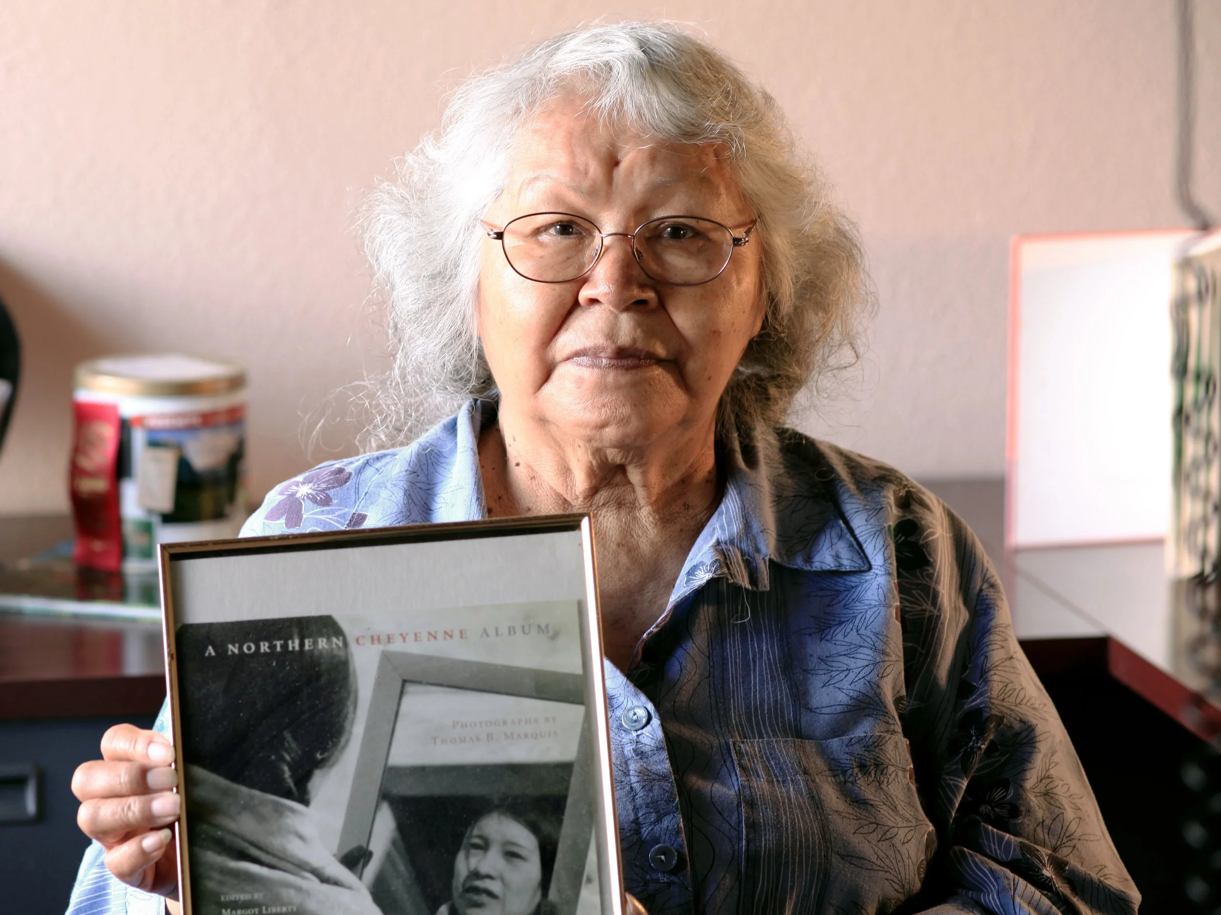
Edith Bowers, interviewee
Good color grading should always match the project genre and narrative tone. It requires respecting original footage, preserving its natural texture, and serving the story’s overall mood, rather than blindly following trendy filters or over-stylizing the image. The best grading stays faithful to the. source material, fits the scene, and supports the emotional atmosphere of the whole production.
Every role in the Post-Production pipeline is irreplaceable, and every detailed craft step contributes to a high-quality final piece. This project allowed me to step out of my 3D comfort zone, build practical skills in 2D animation and DaVinci color grading, and reshape my understanding of visual post-production.
Written by Yucheng ‘Rain’ Xie